In modern world, logos are all around us. Enterprises produce branded and trade badges, emblems, abstract labels and other original tracing for brand recognition. By the time, the activities of company increase or change at all, in this case, each company improves its logo, which will reflect the new realities.
In this article, we will tell about evolution of some world logo brands.
Nike
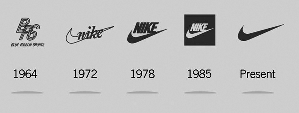
It is difficult to trust, but the legendary logo-tick costs for compony only 35 dollars. Its author was student Caroline Davidson. The logo-tick or “swoosh” makes you see the movement on trainers, where “swoosh” means the whistle with which the sportsman in Nike trainers. The success of the Swoosh was the start of Caroline’s career, and that 35 dollars led her to millions.
Twix
![]()
The famous chocolate stick started producing in 1967 in the Great Britain and called Raider. In 1979, the chocolate stick started export to the USA, and exactly here it acquired the familiar name Twix. But in Ireland, the chocolate stick still sells under the Raider brand.
Apple
![]()
Not many, who knows that the first Apple logo (1976) was an engraving depicting Isaac Newton under an apple tree. The logo designer was one of the founders of the company Ronald Wayne.
It is interesting, that after two weeks the opening of Apple, Ronald Wayne, not believing to the success, sold 10% of stock for 800 dollars and left the company. By the result of that decision billions of dollars of future profit were lost.
In 1977, designer Rob Yanov, at the request of Steve Jobs, developed a new logo, taking into account the requirements of the customer: simplicity, modernity, recognition. The rainbow bitten apple was a trademark of Apple until 1998.
Keeping the idea, the Apple logo periodically changed its color, volume and texture. The bite-sized apple familiar to us today was created in 2015.
Lacoste

The crocodile logo is recognizable all over the world. He appeared in 1933. The founder of the company, Jean Rene Lacoste, was a well-known tennis player of that time, it was he who began to use the polo shirt as clothing for tennis. Among tennis players, Lacoste had the nickname "Alligator", so when he decided to start producing shirts, he took the image of a crocodile, which one of his friends had once drawn, as the logo of his brand. When Lacoste was still playing tennis, an embroidered crocodile adorned all his sports shirts.
Lamborghini
![]()
The logo of this “luxury” car brand shows a bull preparing to attack with its horns. At the beginning of its existence, this company produced tractors, besides, the founder of the company, Ferruccio Lamborghini, was a fan of bullfighting, so the bull became the symbol as the embodiment of strength and endurance. Later, the company began to produce cars that were supposed to compete with the Ferrari brand. Lamborghini are powerful, expensive supercars these days, and the golden bull emblem suits them very well.
Coca-Cola
![]()
The first logo for a popular drink was created in 1893. It was an emblem that consisted of the name of the company, but in black, and the font looked like neat handwriting. Its author was Frank Robinson. The trademark has repeatedly changed its font, background and even the name - in 1980 the drink was called Coke, but after a while it was returned to its former name, and, accordingly, the logo. The current logo of Coca-Cola almost completely copies the original version of the brand, except that the letters are now red on a white background.
Resource: koloro.ua; turbologo.ru; stoneforest.ru; aromo.ru